Over the last few months, we’ve been tracking the Energy Efficiency Directive (EED), a European energy and transparency law in Europe. It’s intended to help the European continent hit its climate goals by helping policy makers understand both the current and future environmental impacts of various sectors, including the fast growing data centre sector. In July, the first report was published sharing insights about the data collected so far, and given our interest in a fossil-free internet, we devoured it. In this post, Chris shares some of the key takeaways.
A bit of context – what is this report about?
A couple of years back, the Energy Efficiency Directive (EED) was passed in Europe, which required data centre operators above a given size threshold to report on a number of metrics relevant to understanding the environmental sustainability of data centres. Broadly, this covers things like:
- How much power they used in a single year
- How much water they used in a single year
- How much of the power came from renewable sources
- Where they were geographically (i.e. postcode and country)
- And other metrics too, that we won’t cover here for space reasons.
These are metrics that data centre operators can be cagey about. But they’re also crucial to understanding the energy demand of the sector in relation to others in Europe, particularly in the context of binding legal climate targets that exist within the European Union.
Given many data centre operators really don’t like disclosing this, a concession was made. While the law said you were supposed to publish this data openly, you didn’t have to if doing so meant sharing trade secrets. Data centers say they consider it a trade secret.
But to account for that, there was another law passed, with the exciting name Delegated Regulation (EU) 2024/1364). This pretty much says, this information, even if it is not published for the world to see, still has to at least be submitted to the European Commission via the corresponding EU state the data centre is based in. So if you have a data centre in Ireland, you have to report to the Irish regulator, who then passes it to the European Commission.
The plan was this data would be released in some kind of cleaned up, aggregated form in 2025 along with a report to explain the findings from collecting all this data, to help inform new data centere sector laws inline with the European Union’s own climate goals.
The first public report, the Assessment of the energy performance and sustainability of data centres in EU – First technical report, is now live, as of July.
So, now it’s out, what can we learn from it?
Here are our main insights.
This is probably the most complete data in the public domain, but even then, there are significant gaps.
Through running our Green Web Dataset, we’ve first hand experience of how hard it can be to get meaningful data about sustainability from large technology service providers. With this report being published we can confidently say we’re not alone.
Even when the law explicitly says sharing this data is mandatory, there’s around a 36% participation rate from companies that own and operate these data centres in Europe. We know of no consequences for not reporting at present.
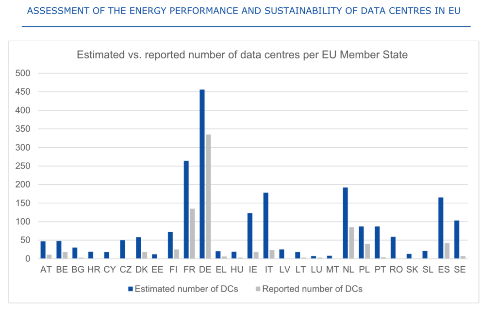
In some countries like Czechia, there was zero data reported. In some real political hotspots, like Ireland, the participation rate was particularly low with around 1 in 6 reporting.
On page 23 of the report, for the curious, there is a table showing the same data.
We’ve shared this chart because it points to loads of room for improvement. The report has a number of sensible recommendations for improving the process of collecting data, but it also has implications for insights shared for the rest of the post. We’ve added some commentary in a few places, but for the most part, for the rest of this post we’ll try to talk about what the data presented is showing.
Smaller data centres tend to be less efficient, but not by as much as larger providers suggest.
Well, another insight from the data was that while there is a pattern of smaller data centres being less efficient than large data centres, as shown by the higher PUE values, the difference between the average for the largest and the smallest ‘bucket’ of data centres is about 40% – less than we expected. Here, PUE refers to Power Usage Efficiency, and is intended to give an idea of how much energy is being used to keep a computer cool enough to work properly rather than do the actual useful computation.
A more efficient data centre facility has a lower score, and a perfect score is 1.0. This number can only go up based on how much energy is ‘wasted’ on keeping computers cool, so in the chart below, shorter bars are better.
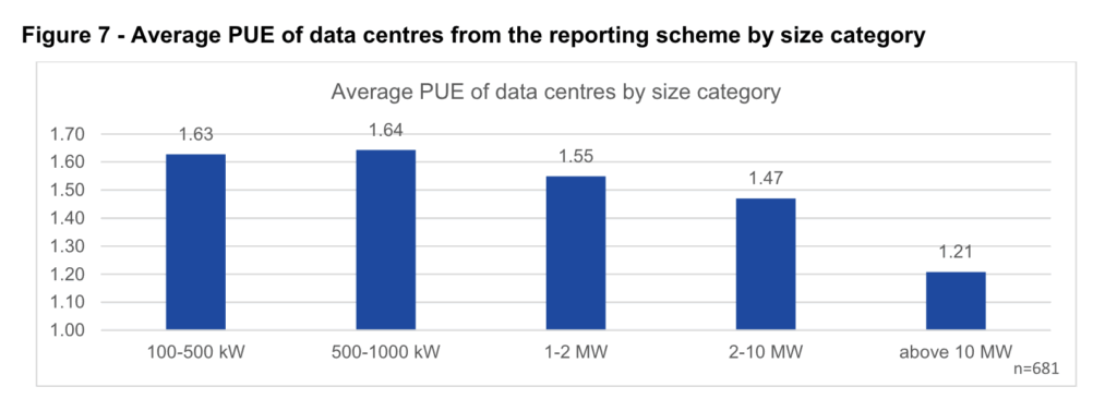
While the gap in PUE is significant, it’s quite a departure from the vision painted by larger providers saying that one of the big problems with data centres in Europe was that we had a long tail of smaller, massively inefficient data centres with massive PUE values well above 2 or 3.
The argument made was that these individually may not have been huge energy hogs, but when considered together added up to massive amounts of energy being wasted in absolute terms.
Of course, the proposed solution to all this waste amongst small providers would clearly be consolidate all the computing in one of the large provider’s big centralised, more efficient data centres instead.
That was the narrative, sure, but it’s not clear that the data on PUE here supports it.
Again this is based on the data shared for the report. If there was more data disclosed by operators of data centres, we might be able to have a better data-informed discussion about how accurate these charts are. But at present, even laws requiring mandatory disclosure are not being followed, so for now, this what we have to go on.
Larger data centres in the dataset tend to be less water efficient than smaller data centres
One of the surprises from the reported datasets was that the equivalent to PUE for water, called Water Usage Efficiency (WUE), looked somewhat like a mirror of PUE charts. As the data centres became larger, they used more water for each unit of power going towards computation. Like before, shorter bars are better.
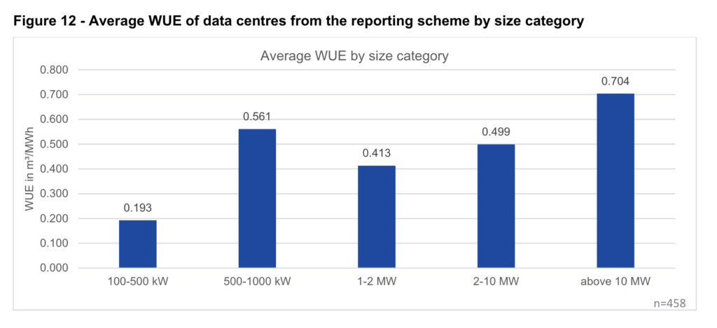
On one level this makes sense, because larger facilities tend to have more servers in one place, which means more heat to get rid of. Evaporative cooling with water is an effective mechanism for getting rid of a lot of heat from one place, but it’s not necessarily efficient from a water point of view. Again, this seems to contradict the “bigger is more resource efficient” argument that we frequently see used.
This isn’t the whole story. We see a real jump in WUE at the 500-1000 KW size, which could suggest less well optimised facilities at this size.
WUE is also affected by the climate you place a data centre in. Having a low WUE is much more important in a dry, arid climate than a wet one where fresh water is plentiful. The upshot of this is that while we obviously ought to care about wasting water, a single minimum figure can mean different things depending on where you are in Europe. Any future standards that do not take this into account can end up penalising some operators unfairly, and facing understandable pushback.
However it’s also worth bearing in mind that a lot of the time, the biggest driver of water use associated with computation in a data centre comes from the form generation used to provide electricity. This is less localised to the data centre but still important, and this is not captured in the current metrics. This is another reason we’re in favour of a fossil-free internet – less fossil fuel generation means less fresh water consumption there too!
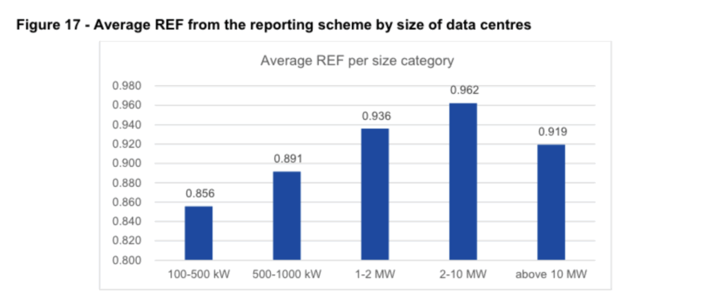
Renewable energy usage was already relatively high on an annual basis, across data centres that reported. Larger providers tend to score higher.
Another thing we saw from the data was the widespread use of annually matched renewable energy across the board. This was represented with a metric called REF – Renewable Energy Factor. Here, a score of 1.0 means 100% of the energy used came from renewable sources. We’ll use percentages in this commentary here for readability.
REF was very high across the board in the dataset, with even smaller providers reporting at least 85% renewable energy. This trends upwards as data centres get larger, with the second largest data centres grouping showing more than 96% of their power coming from renewable sources. Even at the upper hyperscale end, we see high figures – around 92%.
At first glance, this sounds great! There is some nuance to this though.
REF here refers to energy reported on an annual basis, and a few different kinds of evidence count towards a data centre’s REF score.
Nearly three quarters of the claims to use renewable energy are based on annual “guarantee of origin” certificates, over stricter power purchase agreements.
When we think about data centres running on renewable energy, many of us get the idea that someone saying they’re powering a data centre on renewable energy means that the only power they are using is coming from renewable sources. This is understandable, but does not reflect the physical reality of how grids really work, nor how REF is counted. The chart below really drives this home.
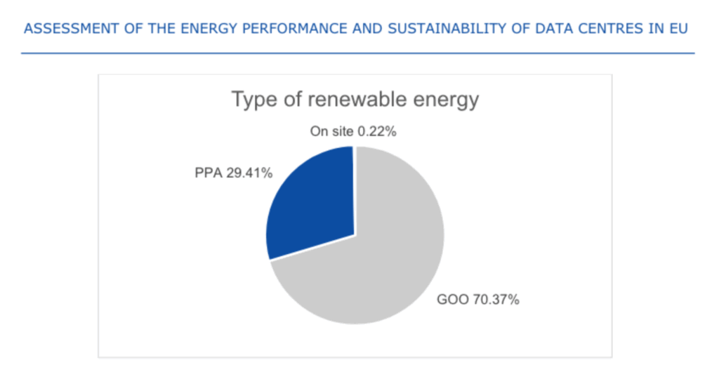
The pie chart above shows the basis used for the REF metric defined above – with supply of power coming from three sources:
- On-site generation – solar panels, wind turbines, hydroelectric power and so on, on the same site as the data centre facility.
- PPAs – a Power Purchase Agreement, or a long term contract to buy green energy from specific generators. Data centres get a predictable price, often lower than the grid, and in return the agreement to buy the power helps the renewable generation project get built.
- GOOs – Guarantees of Origin are annual certificates sold on by green energy generators to traders, that can then be re-matched with existing power from the grid, to make the power count as “green”.
As the pie chart demonstrates, GOOs form the basis of green claims for the overwhelming majority of power used (~70%), followed by PPAs (~29%) , and with on-site generation barely visible – representing less than half a percent of generation across the fleet of data centres in Europe.
A word on GOOs
GOOs, sometimes referred to as EACs (Energy Attribute Certificates) are the default mechanism written into the law in Europe and frequently other parts of the world, for decarbonising electricity. All power marked as green in Europe must ultimately be matched with a GOO to be sold as green power. Even a PPA under the hood relies on these certificates to count electricity as green. The key difference is that (usually), the certificates are “bundled” with the power. As opposed to being separated as a tradable commodity – sometimes referred as being “unbundled”. This use of unbundled annual GOOs is increasingly seen as problematic.
At a consumer level it’s seen as misleading. For the most part, people tend to assume that a tariff listed as “renewable” or “green” means the only power going into their sockets is coming from green generation, with a much tighter link between consumption and generation than exists in reality for the most part. There are now rulings in Ireland from the advertising standards agency saying so, and reports from the UK National Grid operator, NESO also make a similar case.
From the point of view of people procuring electricity, annual unbundled GOOs in their current state don’t do a good job of representing the physical realities of the grid either. This is something that energy buyers already account for in sophisticated contracts that incorporate a plethora of financial instruments to hedge prices, and take into account how the price of power changes based on its availability.
At Green Web Foundation we accept power matched with GOOs in our verification process. Because most of the time, green energy tariffs rely on this matching mechanism to package up a supply of “green” power they can sell as a retail energy tariff.
If we only accepted PPAs, only the largest companies with in-house buying teams would ever be able to qualify. If we only accepted on-site generation, well… you can see in the chart above how rare it is.
Thankfully there are better approaches that have grown to maturity over the last few years, based on more granular process of issuing certificates for green energy. These move from an annual claim to an hourly claim, and take into account whether green electricity is physically deliverable to where it is claimed to be consumed.
Back to the REF metric in the EED report. It doesn’t distinguish from annual or more granular certificates in GOOs, and this detail wasn’t included in original EED data collection process.
There is now an ongoing discussion about adopting these kinds of certificates as the basis for claims for green energy, and the report acknowledges that these more granular certificates allow for more credible claims. We’re currently reviewing how to work granular certificates into our own updated verification process that we’ll be sharing more about in the coming months.
What else is there?
This is a tiny snapshot of the report. It also goes into how the data collection process works, and how this can be improved, as well as covering all kinds other metrics.
If you found this interesting we recommend reviewing the report yourself on the European Commission website, or some of the related slide decks shared on from the report co-authors, the Borderstep Institute’s EUDCEAR website.
What next?
With this report and aggregated data in the public domain, it’s likely that we’ll now see various interested parties jockey to influence new laws introducing minimum performance standards, that are expected in the second half of the year in Europe.
As we know more, and have more to share, we’ll post on Green Web Foundation channels. Subscribe to our newsletter to make sure you don’t miss anything.