I joined the Green Web Foundation this month, and I’ve been funded til the end of August by the German Prototype Fund to work out how to use open data and open source to help speed a transition to an internet running on renewable power.
I figured it might be worth sharing some maps here to help explain my thinking, and hopefully, this should make for an interesting blog post. If nothing else, I it should at least make it easier to understand, how mapping can be used, if you’re new to the technique.
Starting out – let’s map out the value chain for running a digital product
There’s various ways you can think about how you deliver a product or service to users, and one way I find helpful is to think about the value chain.
You start with the need you might be wanting to meet, then you see what’s needed to make that possible. Then you see what’s needed for that, and so on all the way along the chain of needs, until it stops being useful to you for the purposes of planning. If you’re interested in Wardley Mapping, there’s a free book, and many, many videos online.
When I use the term digital product in this piece, I use it as a stand-in for website, web app, or application otherwise accessed over the internet, typically using a common protocol that browsers can use, like HTTP or HTTPS. I might use the term website or app, but it’s best to assume they’re interchangeable here.
For the purposes of this map, I’m assuming our user is someone responsible for running a service or digital product. This might be a developer, a designer, or it might be a product manager responsible for working with a team of specialists to get something out the door.
Now this might be a bit meta, so bear with me – I’m going to start with our user need as making a digital product available to their users. For that, there’s a few things they might typically need.
Let’s run through them:
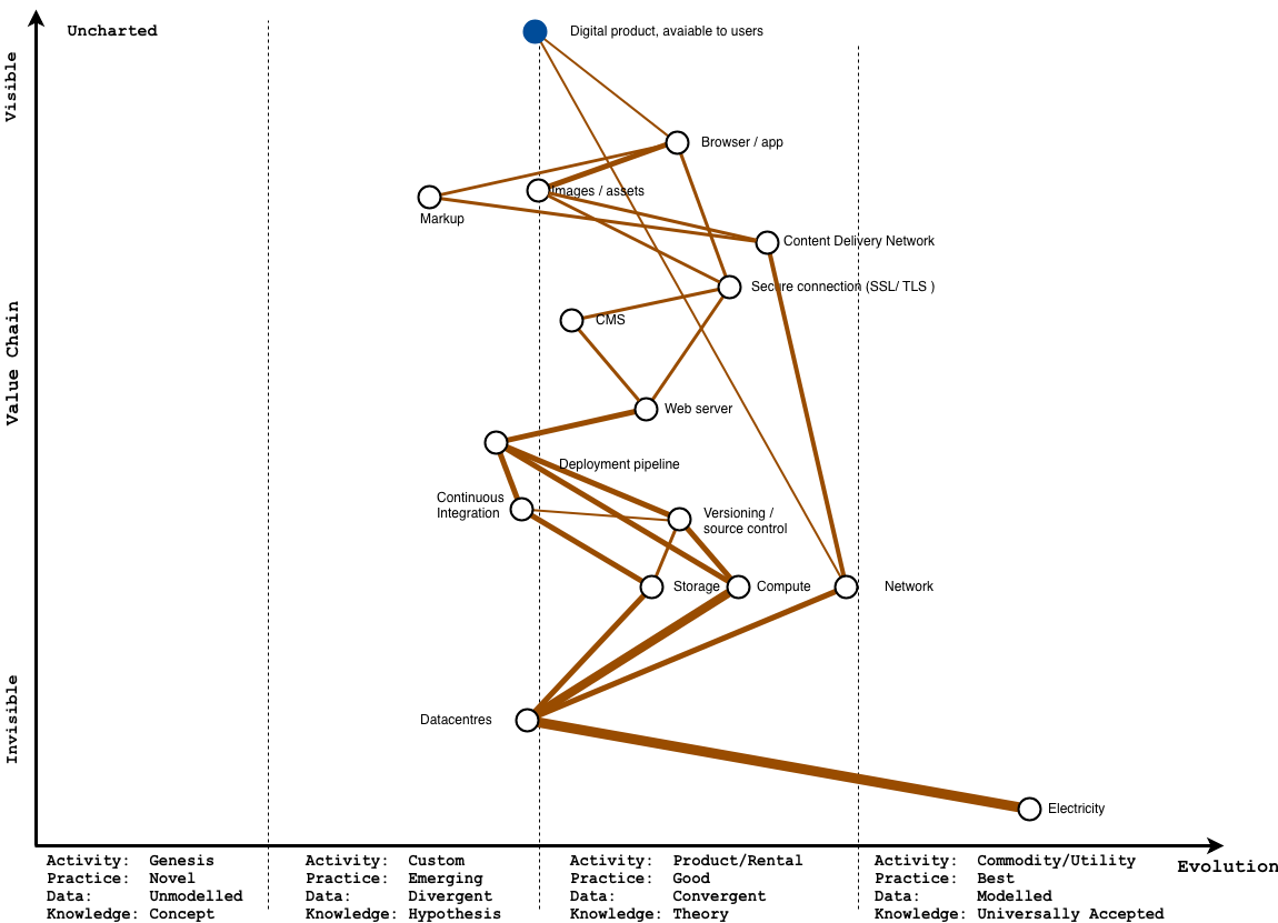
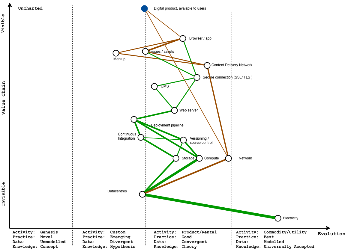
A first attempt at a value chain
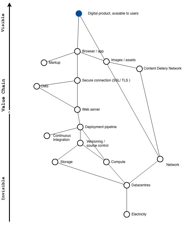
What do we see here?
At the end-user’s end
First, let’s assume our the eventual end-user of this product needs some kind of browser, which might be on a phone, laptop and so on. We’re also looking at an internet app, so we’ll need some form of network connection for them too.
Typically a browser provides some kind of useful experience by presenting rendered content, which typically is a combination of markup, and some assets (i.e. images, movies, or in some cases, gobs of javascript running in the browser).
At the organisation’s end
As the web has grown up, it’s become more and more full of ne’er do wells, who will try to hack whoever they can. So, let’s assume we want to provide a secure connection too, so when people use our product through a browser, they see that reassuring green padlock.
Of course, there needs to be some process providing this mix of markup, and assets to the people using our service. Usually, this will be some web server we’d be running to generate our pages, or serve files. Increasingly these days, to make things load fast, you’d serve some other files from a content delivery network too.
Updating our product
If we didn’t ever need to change our product, this might be enough, but if we want to respond to what’s happening outside our organisation, we’ll probably want to make changes to content on our site. It’s common to use some kind of content management system, (CMS) to allow a wider range of people to make changes to a site, so let’s add that.
Having somewhere to put this
For the more complex parts of our product, it’s a very good idea to have a repeatable way to get updated versions of our product to our users. These days, there will likely be some kind of repeatable deployment pipeline here.
We spoke about changes before – if we want to make changes, it’s really, really useful be able to keep track of changes we make. So we’d also use some form of versioning or source control, which our deployment pipeline typically relies on.
Having somewhere to put this
If we want to keep track of the changes we make, that implies some kind of persistent storage of data (this might be in a database or just a bunch of files – it doesn’t matter quite so much for this map).
And if we want to make changes or be able to run web servers in the first place, that implies some kind of compute power.
For computing power, and persistent storage, we need servers, which are almost always hosted in some kind of datacentre. These often rely on some backbone-like network connection between datacentres, but adding this doesn’t change the map so much, so in the interests of clarity, I’ve left this out.
Keeping the lights on
Datacentres use prodigious amounts of electricity.
Sadly, right now most of this electricity comes from burning fossil fuels, because this is the norm for most electricity grids.
That it takes this long to start talking about power, and that electricity is so far down the value chain helps us understand why, at present, the internet mostly runs on coal.
We’ll come back to this, but now that we have a value chain, let’s make a map from it, with our handy evolution axis.
For this piece, I’ve tried using Julius Gamanyi’s set of icons for draw.io, as an experiment. You can see my original file here on Google Drive.
Turning the value chain into a map
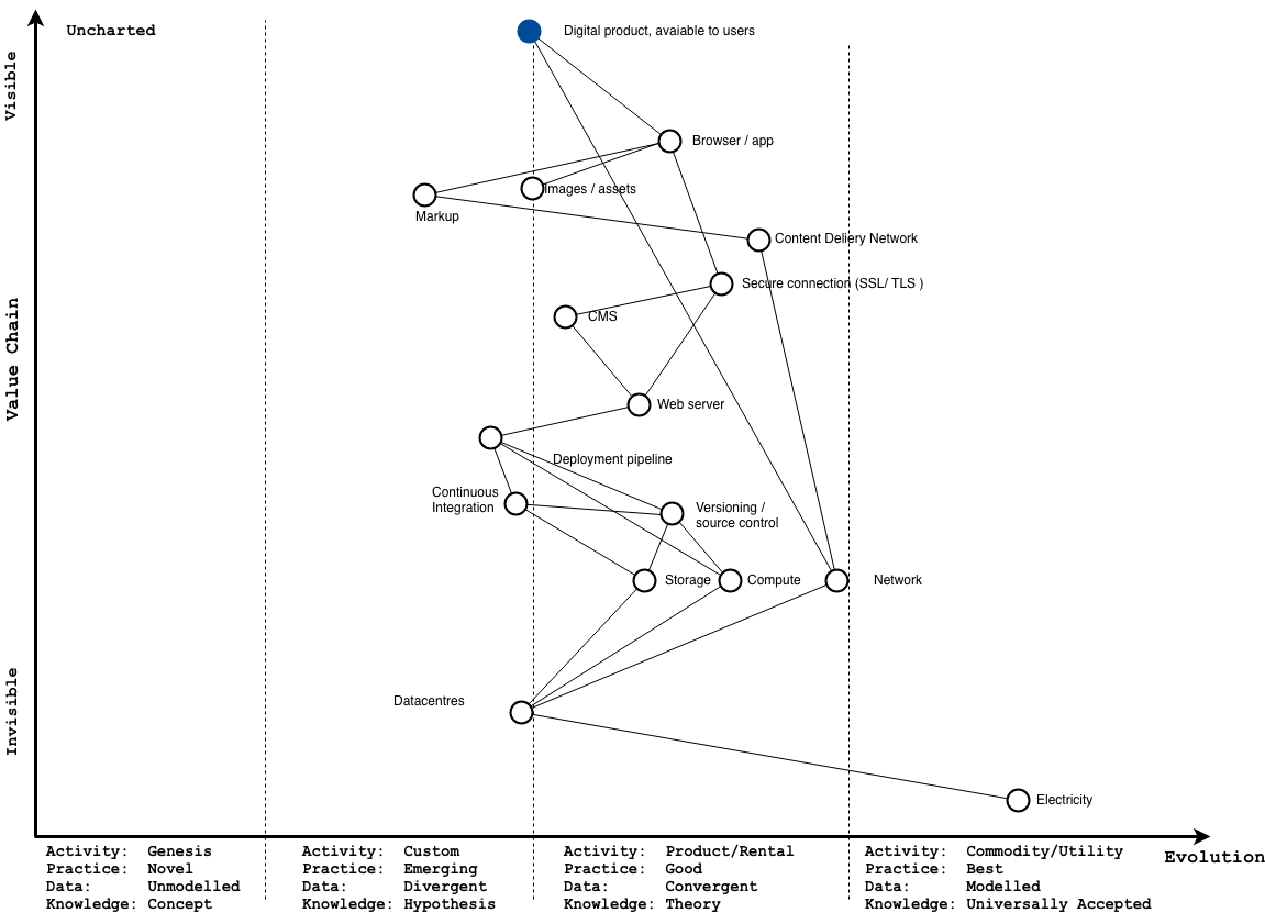
The next diagram here shows how this looks once we’ve had a go at mapping our value with an evolution axis, for a company that runs its own servers, in its own datacentre.
Later, I’ll sub in concrete examples of specific products or pieces of software correspond to each node, to make it easier to relate to, but for now, let’s focus on the evolution axis.
As you’d expect a lot of what we have is either in the product realm (you’ll pay for a product, or hire someone to install it and customise it, or utility realm (i.e you pay on a metered basis, for something fairly undifferentiated).
For the bits that our end users see, we’ll often have some custom code or content that’s unique to us, let’s put it on the left.
I’ve also added an example below, with some actual products or services you might see in use, to make things a bit more concrete.
Using this map
Now we have a map, we can try using it to help us ask ourselves some questions, like, I don’t know…
What if we listened to science, and we acted like we cared about all the avoidable harm we cause from burning fossil fuels by default in the tech industry?
For the purpose of this piece, let’s take the audacious assumption that, given the choice, we would take steps to avoid tends of thousands of early deaths from particulate inhalation from burning fossil fuels, or avoid contributing to runaway climate change, and all the conflict and harm associated with it.
There’s typically two strategies you will see people using and talking about when the subject of technology and climate change come up.
They’re not mutually exclusive, but they look a bit different on the map.
If we use colour to represent the kind of energy flowing through the map, and the thickness to represent how much we’re using, we can represent both strategies.
Strategy 1: Reduce how much you emit, by matching useful work to underlying usage, and using more industrialised infrastructure
Before we map this, let’s refer to the report by the International Energy Agency’s own report, Digitalisation and Energy from 2017, to see what’s been happening over the last few years, so we know what we’re trying to represent.
The report outlines:
- how a shift to cloud to has helped take the edge of the growth in energy use in datacentres, but also
- gives some very rough indications of energy used by different components we might show on the map.
We can see this in the charts below, from the report.
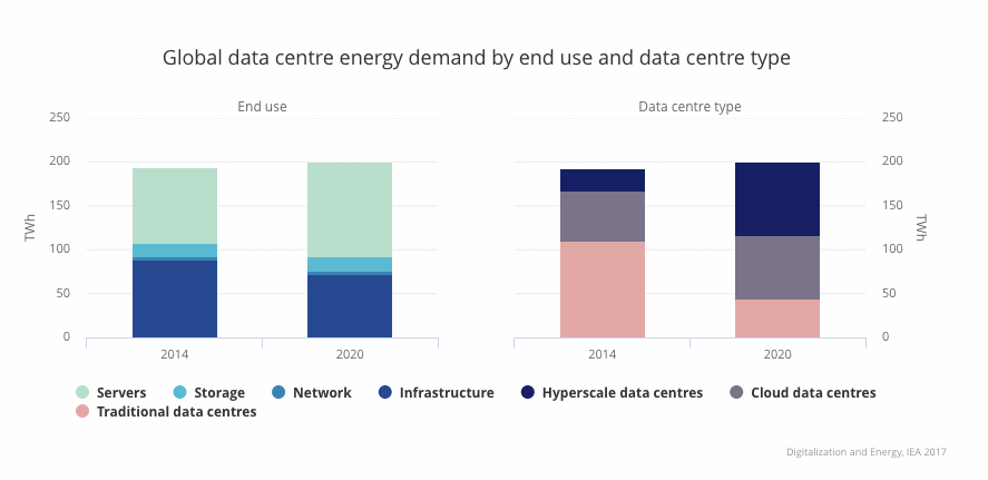
On the left set of charts, we see what kind of kit is using energy in datacentres – servers (i.e. compute), in light green make up the lion’s share of energy, followed by what they call infrastructure (in this case, HVAC, and chillers) in dark blue, for keeping servers cool.
The turquoise and darker green represent storage, and the network respectively, which are both much smaller.
On the right chart we see how the market has changed over the last few years – you can see how energy demand has grown slightly, but not by all that much in absolute terms. You can also see how much of the pink area, representing less efficient traditional datacentres been replaced by the shift to cloud, and hyperscale (i.e. Amazon, Google Cloud, etc) datacentres instead.
What might this look like in our maps?
I’ll show the map pre-cloud, with a very rough estimate of how much energy is flowing through it, then I’ll show a map with a bunch of techniques applied to use more industrialised services, and how they change the map
Remember – colour indicates the kind of energy we’re using, and thickness indicates roughly how much we’re using.
Showing this shift in the map – before
Because so few people think about where the energy running our servers comes from our power overwhelmingly is brown power from fossil fuels. Because in-house datacentres are less efficient than cloud datacentres, they end up needing more energy to do the same amount of work, which means more emissions.
We know compute is a more energy-hungry than the storage and network, so the lines for those are a little thicker accordingly.
Showing this shift in the map – after
Now, let’s look at the map with more appropriate techniques applied.
I’ve grouped them at three levels, Platform, Packets, and Process, which is the mental model I find most helpful and use in talks about the subject, and map fairly well to the official GHG corporate standard for reporting emissions for digital services and ICT
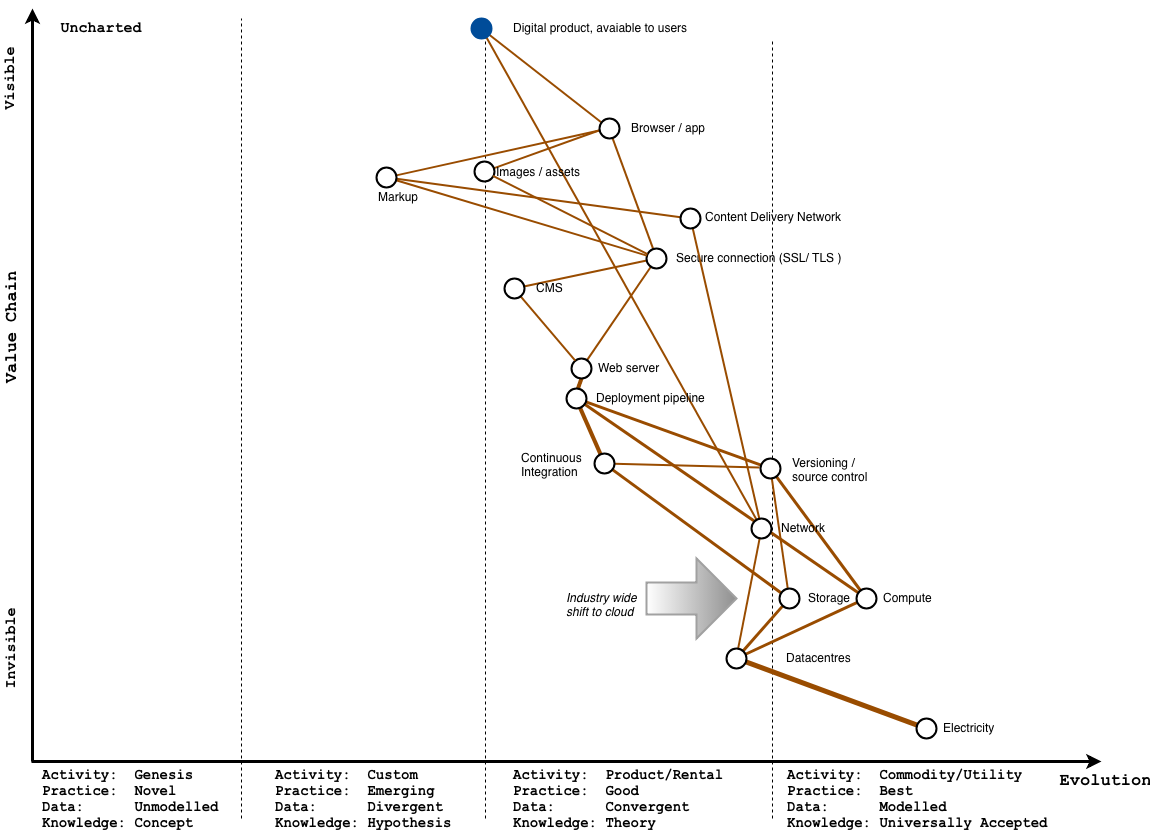
At the platform level – moving to cloud
This is pretty much the whole premise of cloud – by treating compute like a commodity, it’s used in volumes that make it economies of scale possible, and you end up with vastly more efficient datacentres. Also, the computing you do pay for, you can scale up and down more easily to meet demand.
You can see this on the map with the compute, storage and datacentres much further to the right. Industrialising this ‘pulls’ the other components to the right too, to the point where you’re more likely to pay someone else to run continuous integration for you, and rely on a larger provider like github for hosting code.
You’d also rely on some kind of object storage, like cloud storage from Google Cloud Platform, or Amazon’s S3 service, where you pay in pennies, per gigabyte.
For the same amount of work, all these services are more efficient as they benefit from economies of scale, so we use less energy – hence the skinnier lines.
At the network level – sending less over the wire
Because you pay for bandwidth, there’s a direct incentive to send less data over the wire, but it also has a (relatively small environmental) impact – you save money by being parsimonious, because you need less infrastructure running to support shifting all these bits around, which resuling in lower emissions.
In addition though, when it comes to the web, time is money, so you also end up with a snappier user experience, so people can do what they came to do faster, and in greater quantities. I’ll leave out discussions of Jevon’s paradox here for now, where greater efficiency drives more absolute use, because that pretty much applies to all of capitalism, and this post is already large.
Again, I’ve represented the impact of reduced emissions by making the lines thinner where network is involved, like the content delivery network, network, and assets, and markup nodes to represent less energy used.
At the process level – using appropriate techniques
You’ll often see people in lean or agile circles talk about process when it comes to product development in terms of avoiding waste, where waste is everything that doesn’t directly generate value for end users or customers.
You can see this in the shape of the updated cloudy map itself (fig 6), where there’s less undifferentiated heavy lifting taking place. Also, where services are paid for as a product or service, there’s a often clearer link between the amount you pay to provision, versus your actual usage, giving a direct incentive to think about use.
Buying the knowledge about how to change our map
There’s one thing we should bear in mind here – the knowledge of how to take a product or service, and make a map for a service look less like the earlier one, with all the thick lines, and start to look more like the one with more components on the right with thin lines – is not evenly distributed in the industry.
In fact, it often relies on specialised knowledge and new forms of practice – and because acquiring this knowledge is expensive, the organisations or people who have this tend to be expensive too.
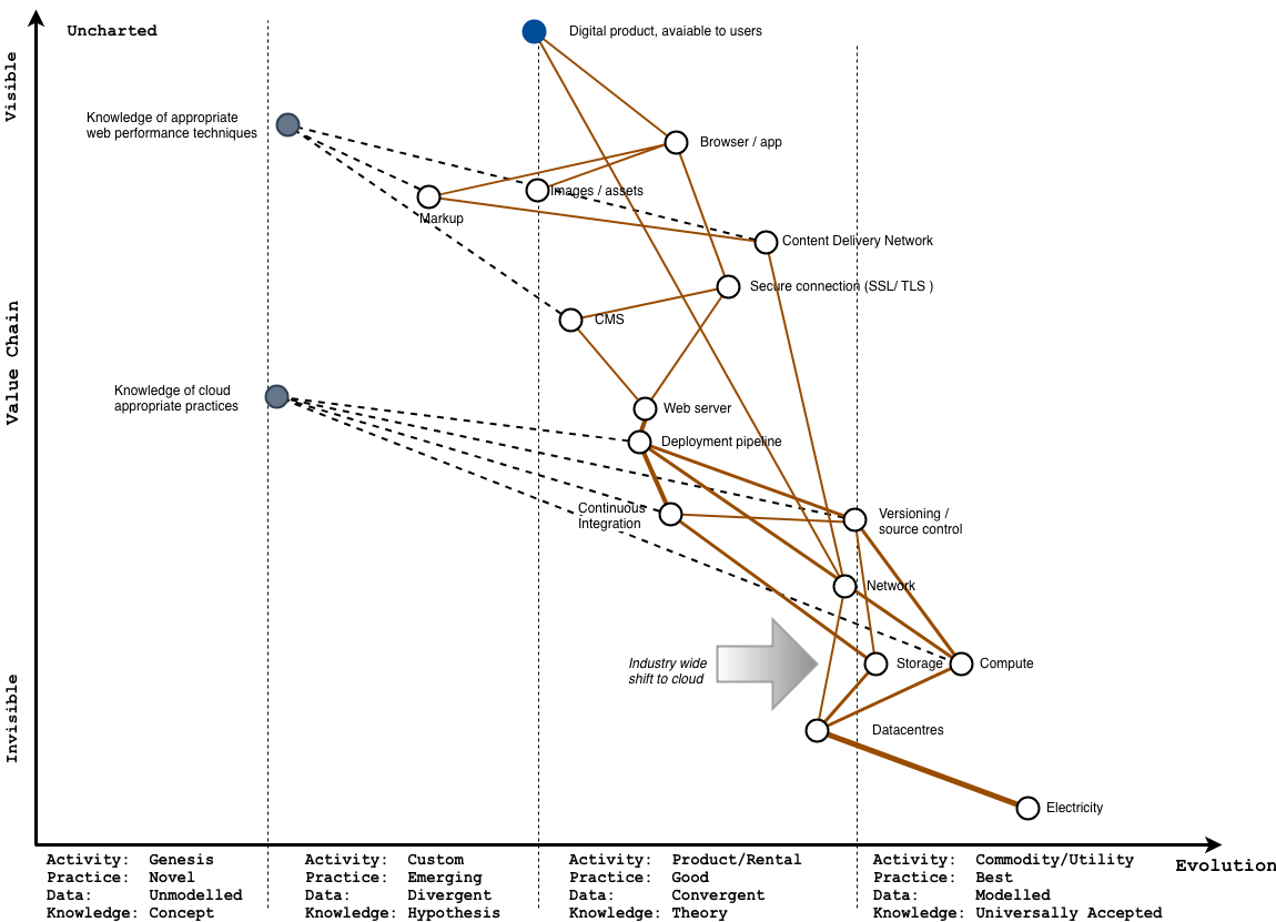
Because of this, your product needs to be successful enough, or large enough to have sufficient usage to justify hiring these expensive people, in the hope that they’ll create more value than they cost, so you make a return on doing so.
In all these maps, where savings are taking place, they’re largely doing so because there’s a happy alignment where reducing wasteful usage translates to savings being passed along by providers.
This is intrinsically appealing if you work in tech, as now, armed with this knowledge, you might feel like captain planet for just doing your job.
I’d request you keep reading for the second strategy though.
Strategy 2: Reduce how you emit by changing where electricity comes from
The other option, is to look upstream, make a change there, and see the effects cascade through the entire map.
Let’s say we wanted to only run our own infrastructure on 100% renewable power.
Our map might look like the one below. I’ll explain the colouring shortly.
Wait. Why isn’t it all green?
The short answer is because the internet.
We can green the parts of the value chain we control directly, but because packets of data travel through the rest of the internet, it gets much harder to have any meaningful influence beyond this.
Think of all the datacentres data has to pass through to reach your device.
Every datacentre it passes through, in every different country, uses electricity that might come from a different energy mix, at different times of day.
So, here, we don’t have direct control over how data travels through the internet – the best we can hope for in the short term is to control how much we use.
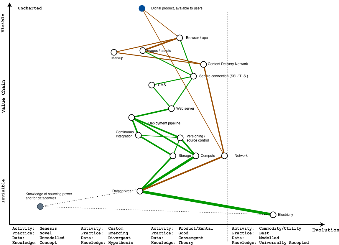
How do I know what is green?
Okay, let’s look at just the bits we can control. The problem here now is that if we want to only use green power, we either have to run everything ourselves where we directly control the infrastructure we use, or only choose providers who also exclusively run their infrastructure on green power
Right now, this is an expensive, manual process, and either involves loads of specialist knowledge about the ways you might buy green power, or asking a lot of the same questions of everyone you buy services from, and hoping they know and/or care.
Because this is far from most customers, and pretty tedious to collect, it’s in a really sad, sad part of the map – right at the bottom, and all the way to left.
Sad times.
What if we could make this easier to find out?
What if it was easier to find out how a datacentre was powered?
For the last 10 years, the Green Web Foundation has been collecting data on which sites run on which power, by combining properly nerdy analysis of how networks are built, using commonly available sysadmin tools, and collating evidence about how the datacentres are powered by straight up asking people who run them.
It’s also been tracking when sites have changed, to make it possible to track the shift of the internet away from fossil fuels.
So… what if checking this information was as simple as an API call, against a domain?
Let’s try mapping it.
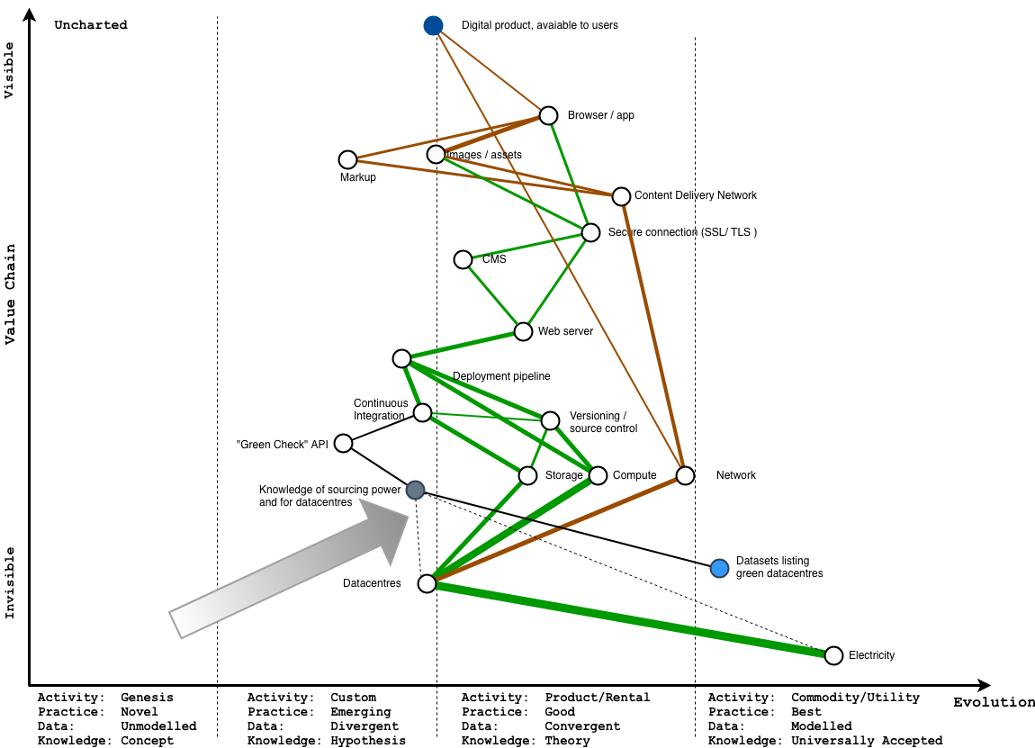
This is what we are working towards now. We’re opening as much as we can, to get this knowledge out of that sad part of the map, by making it as easy to consume, in as many ways as we can.
Right now
This information is accessible in two main ways – deliberately checking a domain against an API, or using a browser extension to show this to you as you use the web.
Over the coming months, we’ll be making it easier to both access this data, by creating a regular release of open datasets in this field, but also make it easier to add to this via the API, so the data releases are more useful. We want to make it easier to build upon the API, or use the data to come with new things we haven’t thought of.
Competing on green in the world of tech
In the end, this is what we’re aiming for – we want to make it much easier to compete on green credentials, because all things being equal, we think most people, given the choice between comparable providers, would prefer to choose the one that doesn’t have all the human costs of burning fossil fuels associated with them use a service.
So, when and how might this info be useful? We’re not sure, but we have a few ideas
When choosing your suppliers
If you’re looking to choose provider for part of the value chain on this map, it should be easy to find this information, and take it into account then deciding who’s in your value chain. Especially if, like lots of large companies you’ve already publicly said you are doing this.
When you’re finding people to work with
If you’re looking for a new job, when you have the most leverage possible, you should be able to check if an employer is walking the walk, and talk to them about this.
It’s increasingly common to talk about diversity in conversations about finding talent now, and increasingly smart managers hire for diverse teams.
We know who climate change hits the hardest, and we know it hits the people in the communities we want to hire from if we want a more diverse industry.
When helping others rethink how they deliver services
And if you want to use this data in products or consulting to make it easier to help people move away from fossil fuels, and compete on this, you should be able to.
A huge amount of money is spent moving to the cloud, and there’s obvious leverage in moving existing workloads to greener clouds wholesale.
But you don’t need to wait til then.
Just like adding you can tests each time you see a bug in a codebase to clean it up over time, you don’t need to wait until you’re about to shift to a new datacentre to start cleaning up your supply chain. What if there was a ‘green ratchet’ policy, where ever new service going into production had to run on green power?
Help make the web green
One of the reasons we’re taking an open approach with the Green Web Foundation, is that when you’re a tiny NGO, you need all the help you can get, and “open” is a strategy that can help when you don’t have much in the way of resources at hand, to increase your reach.
So, if you’re interested in working with us, from auditing your own supply chain, to building tools or services to help transition the web to run that runs entirely on green power, please get in touch – send an email to [email protected], or if you prefer twitter, send a DM to @mrchrisadams.
If you’re just curious, you can alway join the low traffic mailing list for updates as we work on this.