As part of our recent Branch Issue 9 launch and website redesign, we debuted a new way to interact with the grid-aware design on the website – a Grid-aware Status Bar. In this post, Fershad Irani – lead developer on the Grid-aware Websites project – unveils the backstory of the Grid-aware Status Bar, some of its key features, and explains why we decided to build it as a web component that anyone can use.
One of the objectives we set for the Grid-aware Websites project when we started planning it last year was to deploy the project on the Branch magazine website sometime in 2025. In doing this, we could show the code working on a website that receives a non-insignificant amount of regular traffic. It would also be a full-circle moment for the project, since the original Branch design in 2020 was one of the things that got me exploring the ideas of carbon-aware frontends in the first place.
Grid-aware Websites enables the creation of dynamic online experiences that respond to the energy grid they are being used on – delivering core content when the grid is fueled by dirtier energy, and enhancing the experience as the grid becomes cleaner.
As we got further into the project, Branch took on an increasingly important role in showcasing our ideas for how grid-awareness could be applied to websites. We commissioned a new issue (Issue 9) for the magazine around the theme of attunement – reimagining digital infrastructures attuned to life systems, planetary constraints, and our collective needs. This ties in with the whole idea of Grid-aware Websites, designing online experiences that are designed to work with and within the constraints of the energy grid. To top things off, we decided that it’d also be nice to give Branch a modern redesign in the process.
All these things kind of depended on each other, so we decided to bite the bullet and tackle them at the same time. As it would happen, that coincided with members of our team traveling for work, taking extended leave, and our entire team coming together in Munich for a week of away days and Green IO conferencing. There was a lot to do, and a lot of disruption to work around, but to use the vernacular I grew up with – “She’ll be ‘right, mate”. (Narrator: She did, indeed, end up alright)
The idea for a Grid-aware Status Bar emerges
Tom Jarrett designed the first issue of Branch back in 2020, and we reached out to him to see if he’d like to help with the 2025 grid-aware redesign. To our delight Tom said “yes”!
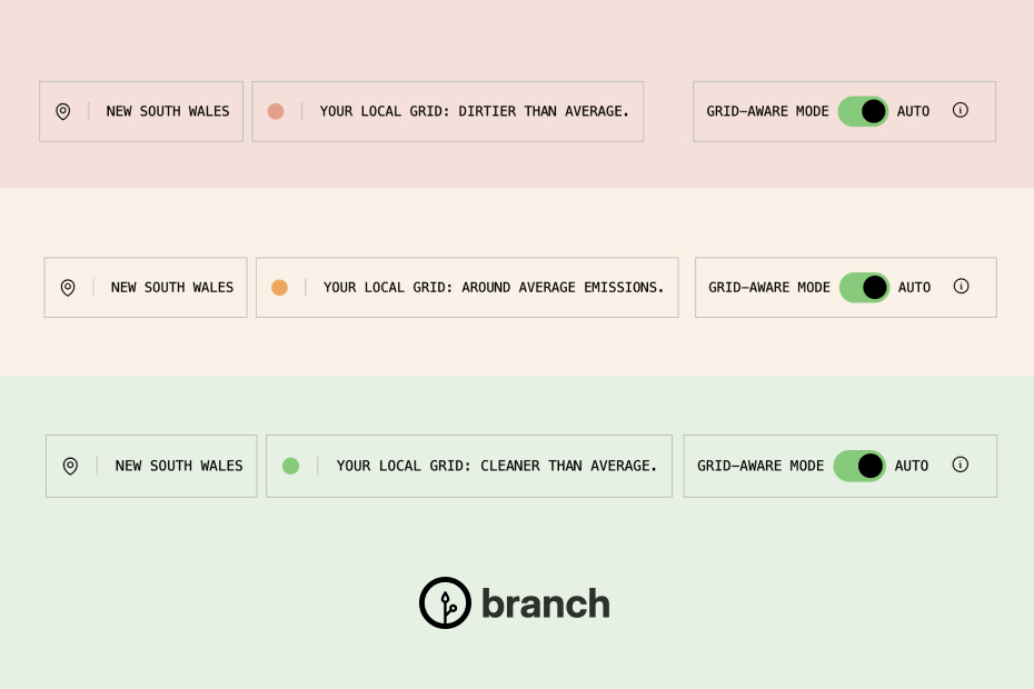
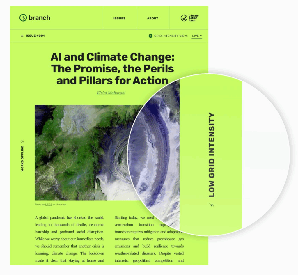
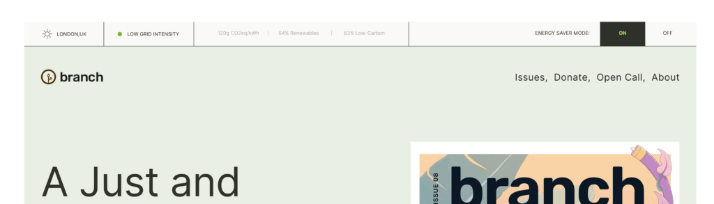
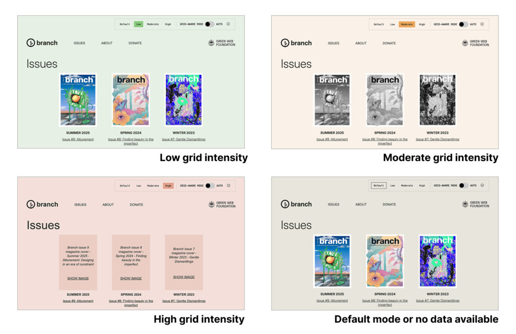
The original Branch design had a small selector near the top of the page which allowed visitors to change between the different grid aware views available – live, low, moderate, high. Grid intensity information was also shown on the far right side of the page (i.e. “Low grid intensity”, “Moderate grid intensity”, or “High grid intensity).
From the earliest iterations of the 2025 redesign, Tom explored ways to adjust this section of user interface (UI). His aim was to provide visitors with simultaneously much more context about their grid-aware experience, and more control to adjust that experience if they want to. We began calling this part of the design the “grid-aware switcher”, which later became the “grid-aware status bar”.
Exploring through iteration
As we continued iterating on the redesign, the Grid-aware Status Bar started to become central to how grid-awareness would be applied to Branch from both a technical and user education standpoint. Many conversations were had about the look, feel, and functionality of the status bar. But many more took place focusing on the wording for different elements within the status bar, what those words conveyed, and how much information should be presented to visitors.
Some of these decisions were made for us by the information available from the Electricity Maps Carbon Aware Websites API which is the data source behind grid-awareness on Branch. For example, the API returns only “high”, “moderate”, or “low” values for a given energy grid which limits the level of detail we could present to a user without making additional API requests.
Other important decisions made in the design process focused on user experience considerations. These went through several rounds of iteration and discussion before we landed on a final design. These included things like:
- How location information was presented to the user (and at what granularity – local grid, region, country?). We went with the local grid for Branch.
- Whether to show a “last updated” timestamp in the status bar. We eventually opted against this to a) reduce clutter, and b) reduce confusion to the user as to what the timestamp is representing.
- How to word the toggle which activates the automatic application of grid-aware design to the website versus allowing the user to choose the view for themselves. After much iteration we settled on “Grid-aware mode” to describe this toggle.
Building a status bar for reuse
When I first saw Tom’s early drafts for a status bar, my mind went straight to “this is brilliant, and something that we should build so that it’s reusable by others as well”. Pretty much I was thinking about it as a web component from day one. That thinking also played an important role in some of the decisions we made around the design and functionality of the status bar.
The “status bar as a web component” idea also introduced some scope creep into the Grid-aware Websites project and Branch redesign. It’s not something we had originally planned for, but it just made so much sense to do that it was worth the extra effort. An unintended upside of this scope creep was that it allowed us to separate out some of the redesign workload – Hannah could work on WordPress code, and I could build out the web component. Being able to split up the work like this was probably critical to us getting the redesign out in time for the Branch Issue 9 launch.

Features and functionality
While building the web component to be used on Branch was the main priority through the development process, we also wanted to make sure we created something that would be useful to any website looking to use the Grid-aware Websites library.
Drop it anywhere on a page
While on Branch we’ve put the status bar at the very top of the site, we can’t be certain that everyone using it would want to do the same. Using CSS Container Queries, a newish feature on the web platform, we’ve been able to build the web component so that it resizes based on its parent element on the web page. This means that if someone wants to put the web component into a narrow sidebar menu, they absolutely can!
To demonstrate this, we’ve put the web component into the middle of this blog post in both a narrow and wide parent container. For folks viewing this post on a desktop or laptop, the demo below shows this in action. Those of you on mobile, try rotating your device.
Oh hey, and these web components are interactive too 😉. Click around. Note: I’ve set different locations and grid intensities for demonstration purposes.
Demo: Wide parent container
This shows the web component being used in a wide section of the page, similar to how it is included in Branch.
Demo: Narrow parent container
This shows the web component being used in a narrower part of the page. Click the caret icon to expand it.
A big thank you to Hannah for getting the initial Container Queries implementation into the component!
Preserve state across pages
The Grid-aware Status Bar allows website visitors to opt-in/out of automatically applying grid-awareness to their browsing experience. If grid-awareness is not being automatically applied (as is the case when you visit Branch for the first time), the user then also has the ability to select the website “mode” they wish to see.
It’s important that these user choices are retained as a user navigates the website. To do this, the status bar web component saves state via cookies in the browser.
Why cookies?
The Grid-aware Websites library has been designed to function server-side (or in edge functions). As a result, we need some way for the state selected by the user (e.g. grid-aware mode auto on/off) to be communicated with the server in a reliable way. By setting cookies in the browser to capture visitor actions, our server-side grid-aware code library can read those cookies as they are included in each website request that is made. This allows the server-side code to know which version of the website to return if the user has manually selected one, or if it should proceed with performing live grid-aware checks instead.
Customisable grid-aware modes
On Branch we have four different “grid-aware modes” for the user to experience. Other websites might have three, or even just two. So we’ve made it possible for developers to specify and name the different “grid-aware modes” on their website. Visitors can select from these modes when not automatically applying grid-aware changes. Developers can also set a default mode which is seen by users who have not manually selected a specific mode to be displayed.
Extra information in a popover
We view the status bar web component as being the main way a visitor would interact with grid-aware functionality on a website. For that reason, we felt it was important to have some way for developers implementing it to tell people about what they’re seeing and where they can go to for more information. Developers can do this by setting a couple of data attributes on the web component when adding it to their page.
The information popover is triggered when a visitor clicks the ‘i’ icon located on the far right side of the “grid-aware toggle”. Again, we’ve taken this opportunity to use some newer browser features which allow for popovers to be added to a page with minimal additional code. Thanks to Nick L for pointing us in the direction of the Popover API. In supported browsers, the popover will appear below or above the web component as space allows. On other browsers, it will appear in the center of the screen with a darkened background. Eventually as all browsers include this new API, the user experience will become consistent.
Using the Grid-aware Status Bar on your website
The Grid-aware Status Bar is an open source project. You can explore the code repository on GitHub which includes installation steps and configuration instructions. That’s also the place you can post any bugs or issues you might be having with the Status Bar, and of course we also welcome community code contributions as well!
If you’re using the Grid-aware Status Bar on your website, then we’d love to know about it. You can tag us on LinkedIn, or get in touch with us via our support form.
The Status Bar is designed to work with the Grid-aware Websites project. If you are using the Grid-aware Websites project on Cloudflare Workers, we have a plugin that can help you get started quickly and includes configuration options to automatically include the Grid-aware Status Bar on your site. We’ve got a blog post coming out soon about how we did this, but in the meantime you can learn more in the Grid-aware Websites Cloudflare Workers plugin repository and in this tutorial on our Developer Docs website.